

Whether you pick white kraft paper or natural kraft paper is as much a brand decision as it is materials. White kraft provides a clean and bright background for CMYK color printing. Natural kraft gives more of a rustic, warm appearance and pops when used with black ink. The choice is determined by the visual character you want customers to detect, color saturation of your design and use cases of how bag will be used.
HangPeng produces custom paper packaging for brands, retailers and other corporate customers. Our kraft paper bags show how paper, print and structure work together. For the kraft paper bag, this means starting from what is its final look and the default printed artwork. Now go through the bag size, construction and handle along with finish. Materials and colors that work on a flat design file should also work once the bag is completed.
For the first review of your sample, evaluate against four elements: branding mood and sensation; color separations (contrast); text contrast / readability; finish handling. When comparing papers, keep the artwork and dimensions identical. This makes it easier to evaluate the impact of the white or natural substrate.
Choose White or Natural Kraft for Your Brand
Start with the impression you want to create
Let us focus on the initial surface level impact at shelf/counter/handover. Natural kraft is ideal for brands looking for a tactile look paired with an earthy, subtle or craft-focused approach. Ideal for bakeries and independent retailers, it will appeal to gift shops and brands already using earthy hues in their packaging. Its brown surface remains visible underneath the design itself and becomes part of the palette.
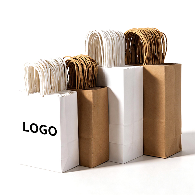
You achieve a different aesthetic with white kraft. Its more minimal base helps colored art read clearly and help make a bright, contemporary package. Within this base, the use of multiple colors or vibrant illustrations may be printed directly upon larger areas. This can create the feeling of a logo that is more prominent when surrounded by open space.
Collect packaging samples of the mood that you want before making your selection. Observe the color of paper, graphic density, type size and finish. Instead of only asking “Which paper is better?”, ask “Which paper makes our design feel like us?”
How the paper base affects printed color
Ink is printed onto a piece of paper that has characteristics such as color and feel. This means that the same piece of artwork will look very different on white kraft compared to natural kraft! The brighter background on white kraft works well with full CMYK artwork. The rich brown tone of the natural kraft becomes a design element itself as part of any color printed on (black ink is great for this high-impact, full contrast look).

It makes a difference when your design has big solid areas, small text, light colors or their own shade of the brand. A lighter shade might be less distinct on a darker paper ground. For instance, a dark logo might read well on natural kraft while you would use white kraft paper for multicolor illustration. These are guidelines for evaluation, not replacement of seeing a sample printed with the selected paper and print method.
For a branded kraft paper bag, they can also be printed in Pantone spot colors. Provide your packaging manufacturer with the color reference, and ask how it will be printed on its stock. Do not think that a reference color will behave the same visually between papers, printing methods or finishes.
Match the paper to your brand direction
The natural kraft can reinforce a laid-back, heritage or handmade visual system. Dark typography and sheer layouts match smoothly with this. For brands with more limited color palettes, natural kraft is sometimes enough contrast without obscuring the rustic look of the paper. Foil stamping with either gold or silver allows for a more refined accent while keeping most of the natural surface exposed.

When the artwork printed essentially carries more of the experience, white kraft is a very functional option. It can accommodate a more whimsical and colorful presentation for in-store or promotional packaging or varieties with multiple graphics. The more open the background, generally speaking designers have a little bit more freedom where to place color and photography-styled art or fine detail in work because of contrast issues.
Consider the entire brand system before deciding. You could find a paper sack sitting next to shipping boxes, product labels, tissue or retail display. Natural kraft could connect them, if those elements already incorporate a warm but natural palette. If the rest of your packaging utilizes bright colors and white space then perhaps that will make it feel more consistent with White kraft.
Review the Whole Bag Design
Consider finish and graphic complexity
Material and finish are to be checked together. A simple black design could be enough for the bag to work (on natural kraft). Foil stamping are suggested more as premium accents, however again that area must be balanced with logo size (really a factor of the fold lines and bag shape). CMYK artwork will allow for a wider range of color on white kraft, but foil or other finishes can still be used sparingly.
HangPeng provides you with printing solutions such as CMYK and Pantone colours along with additions like gold, silver or holographic foil stamping, embossing & debossing options, matte lamination and gloss lamination finishing (as well spot UV). The right mix is all about the work, paper, bags and look you want to create. Note that not every finish will be appropriate for each design. Buyers can more easily review a restrained design with only one focal point than a package with competing treatments.
Have your designer indicate the exact spot on the dieline where each finish will be seen. Test for if a logo lies adjacent to a fold, seam, handle attachment or bottom panel. This helps avoid placing a strong design element awkwardly after assembly.
Choose a bag structure that fits the job
A bag structure not fit for the product cannot be compensated by paper color. Verify the bag size, bottom design, handle and what you intend to put in it before approving a material. A bag used for light retail shopping may also have different requirements from one which holds heavier items. Determine a filled sample having the expected contents such that paper, handle attachment and bottom are evaluated as one unit.
Confirm the packed dimensions and estimated weight of your product with manufacturer. Ask how the paper handle and its attachment to the bag will be evaluated. If the bag is to be reused or carried for long periods, include that use in the evaluation; do not choose a paper weight based only on looks, nor base your selection from samples cut within different sizes.
Ask the provider how custom bags will be packed and transported as well. Folding or flat-packed formats may be beneficial for efficient storage and shipping but the end assembly should still work easily with your receiving team (or retail staff).
Prepare artwork for the chosen base
Remember that orientation of paper you chose and now review your artwork with this surface. Check that small text is still readable, there is enough contrast with important elements and the large areas of color are intentional. If the color is vital to your brand, specify it exactly using an approved reference for that all important hue rather than a mere screen image.
Before going to print, check with your supplier on the printable area and where finishing can be applied. Do not just review the design on the front, but check it on all panels. See how the logo reads when the bag is in use, sitting on a counter or viewed from profile. The visibility of the artwork varies depending on how different parts you choose to expose —whether it be handling, gusset and folds.
For projects that need coordinated structure and print support, buyers can review our ODM/OEM packaging services.
Use Sampling to Confirm Your Choice
Compare representative samples
A screen proof can do a light check for layout and spelling, but it cannot tell how the paper you have chosen feels or what ink really looks like on its surface. If your project is color-sensitive, request a sample or proof as similar to the intended paper and printing method (as well finishes) as may be suitable for the work. Check the bag in a controlled light environment, and compare with a printout of the approved color reference.
When looking at a sample review, inspect further than just the front panel. Examine the side gussets, fold and bottom of its component pieces; observe how a handle is fixed to it and where printed color reaches hidden areas. Check that the bag opens and closes as you wanted. When the bag is assembled, check how the design is positioned, not only how it looks on flat artwork.
Retain the approved sample for production reference. If the artwork, stock, finish or size changes afterwards, find out whether another review is required. By offering a clear approval record buyers and manufacturers can work from the same expectation.
Common selection mistakes to avoid
One common mistake is choosing paper from a color swatch alone. The bag’s printed appearance depends on the paper base, artwork, print process and finish. Review them as a combination.
A second mistake is thinking that natural kraft will make all designs appear earthy, or expecting white kraft paper to look instantly premium. Those are ideas for visuals, not sure brand results. A finalized result thus depends on layout, typefaces used and product group / quality of carrying out the task.
Without factoring in the bag being used, it can also be easy to approve a design. After assembling the bag, verify its proportions, looseness of the handle position and artwork placement. Provide dimensions and/or weight details if the bag is going to carry a product that doesn’t conform.
A practical buyer’s checklist
Before requesting a quote or approving a sample, prepare:
· The brand’s intended visual direction and reference examples
· A decision on white kraft or natural kraft, with the reason for that choice
· Artwork files and Pantone references where relevant
· The bag’s dimensions, packed product weight and handle preference
· Printing and finishing requirements
· The expected order quantity and destination market
· Sample review criteria and the person responsible for approval
This information upfront allows the manufacturer to recommend a feasible configuration, minimizing uncertainty during sampling. HangPeng collaborates with brand owners, retailers and gift companies & other business buyers to provide customized paper packaging. If you would like to discuss a project please drop HangPeng an email with your artwork and dimensions as well as stating how this will be used.
Conclusion
White kraft is for designs where the focus of the design lies on a clean background and colorful CMYK artwork. Opt for natural kraft when the brand demands a more grounded and subtle look, or contrast against dark ink. After that, merge the structure of paper, print and bag through a sample review. Ultimately the material you select is really one that most effectively furthers the brand’s visual narrative, and which also works best for how any given bag will be used.
FAQ
Q: Is white kraft paper suitable for full-color printing?
A: White kraft has a clean & bright background, working well with full CMYK artwork. The final result still depends on paper, print setup and design. If specific colors are important to your brand, provide the reference and review a proof or sample before giving permission for production to begin.
Q: When should a brand choose natural kraft paper?
A: Natural kraft could fit a brand aiming for warm, rustic or subtle appeal. It can successfully handle clean placement and dark ink, even black. Examine the print on the chosen paper in light of how printed shades will show color changes depending on a brown foundation.
Q: Can kraft paper bags use foil stamping?
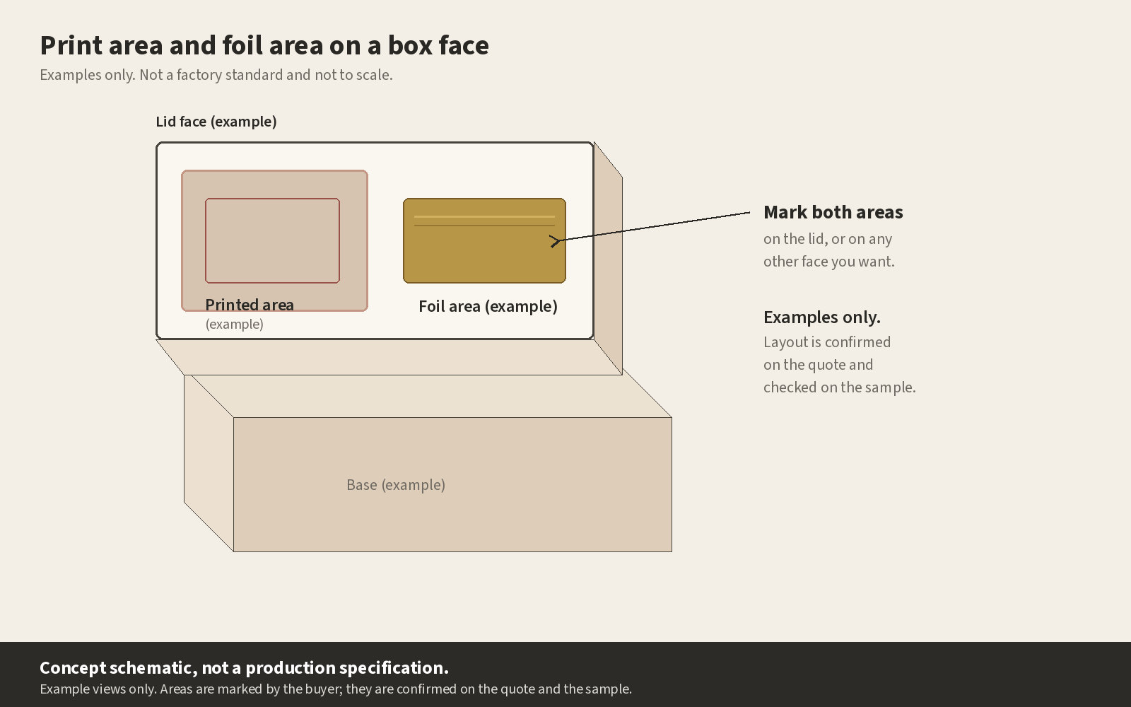
Answer: At HangPeng, we offer services that include gold and silver as well as holographic foil stamping. It depends on the paper, artwork and bag structure. Identify where the foil will go on your design, making sure to look at how it sits around folds and/or seams/handles. Mark the foil areas on a separate artwork layer, and ensure they are positioned correctly around folds, seams and handles before approving a sample.
Q: What information should I send when requesting a custom bag quote?
A: Please supply the bag size, product weight, paper choice, artwork submission details and print colors along with finish selection and handle type as well quantity required. Attach a sample or reference image, if available. These details allow the manufacturer to look at how the piece will integrate into a bag rather than just as artwork.